On this page you should see a number of artists work with at least a paragraph talking about their work. My abstract photographs should be on display on this page along with more writing. My opinion on abstraction as a whole is positive as I find abstraction a very odd and unique topic. I enjoy looking at 'one of a kind' photographs or sculptures as it's always interesting to look at.
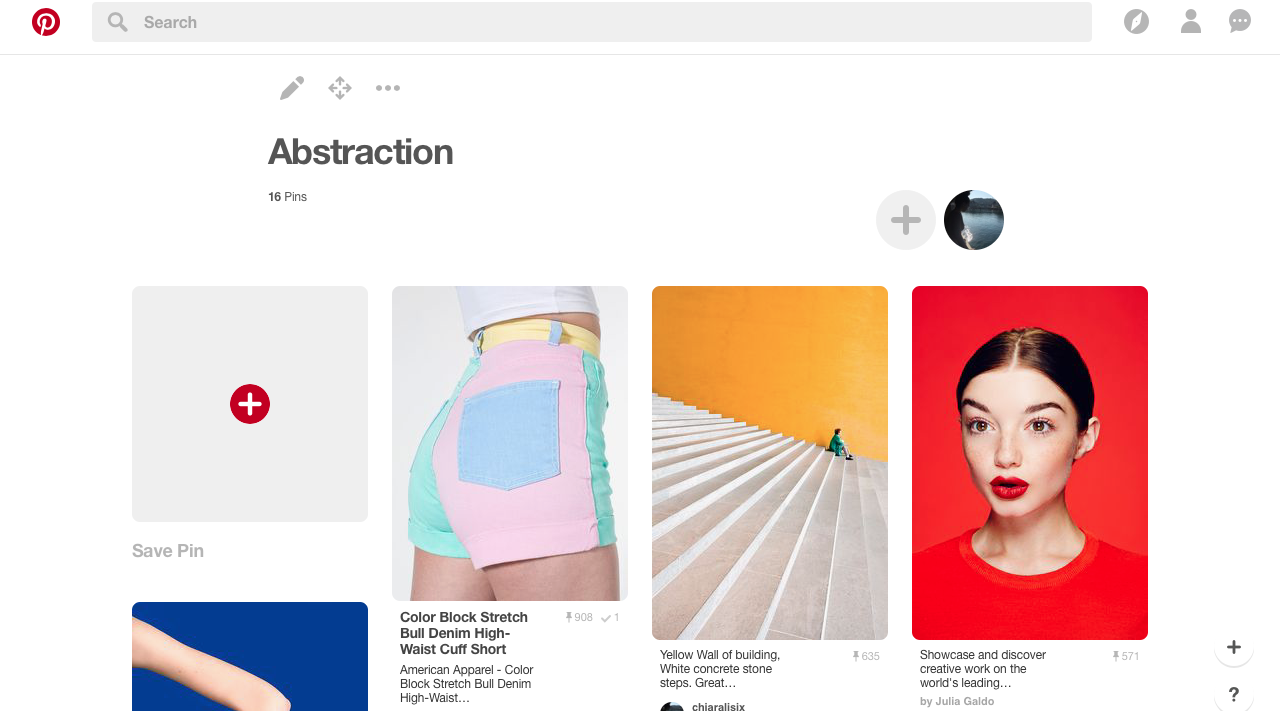
Abstract pinterest
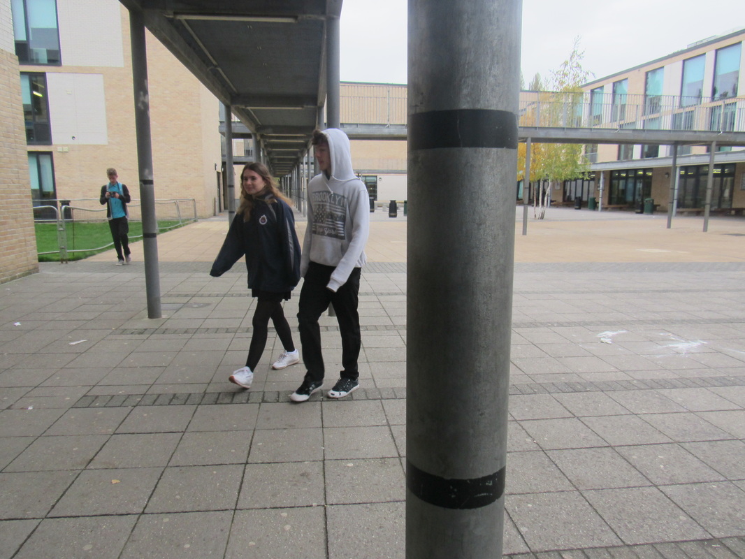
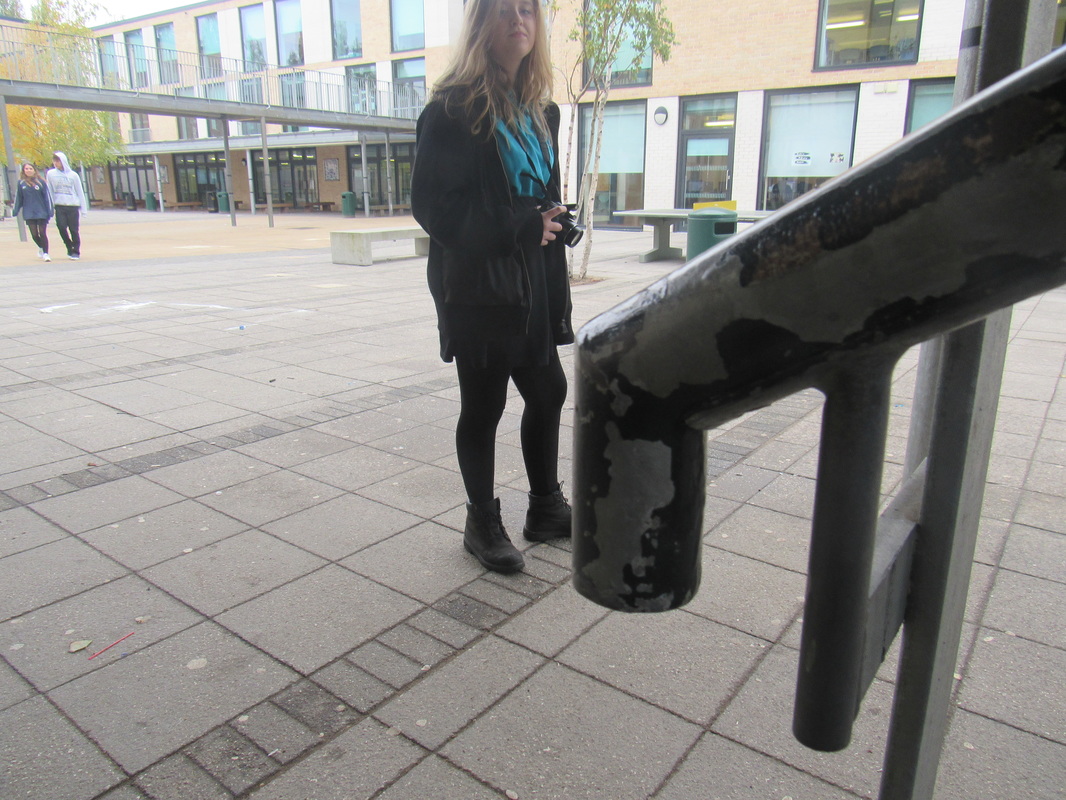
Cover Lesson- Formal Element
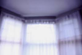
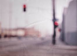
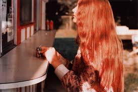
Uta Barth
|
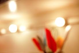
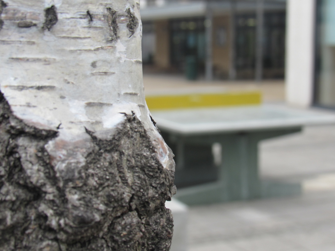
These images are for the theme Out Of Focus, all of the photographs were taken by a photographer called Uta Barth. I chose this image because it reminds me of waking up in the morning to go to school because of the lighting. I think the lighting suggests its early in the morning and its cold outside which gives a warm and cozy vibe. Due to the photograph being out of focus all of the lines and details are hard to identify. The tone in this image is mainly light, there isn't much of a dark tone anywhere which personally makes me like the image more.
|
|
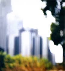

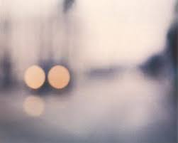
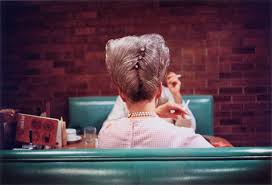
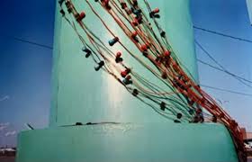
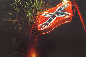
William Eggleston
|
These images are for the theme Expressive Colour, all of these images are taken by a photographer called William Eggleston. I chose this image out of all the other as i thought is was the most interesting and filled with the most colour. The contrast of light and dark is evenly spread as the boarders fade into a darker tone while the middle stays bright. The colour theme is a vintage theme as the lady's hair is up high in an old style.
|
|

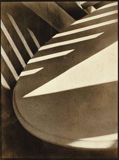
My abstract images.
|
|
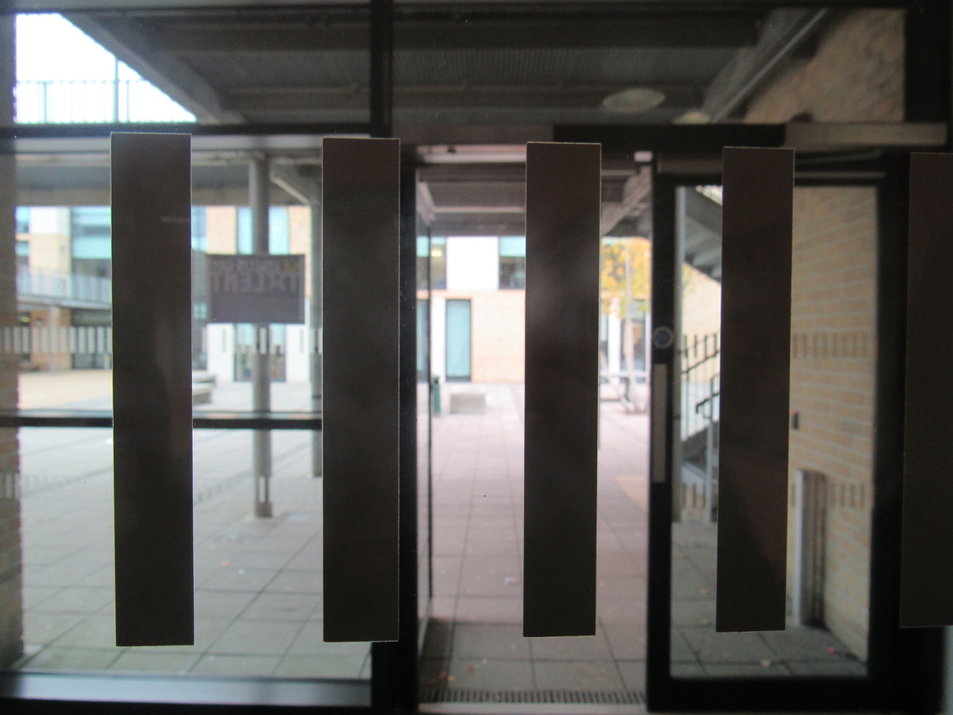
I took these images with the schools camera. I took photographs of the abstract sculpture I made in the previous lesson, focusing on the shadows my creation makes. We focused on the shadows as shadows is an abract sector. The task was to take 12 images, I took 15, and evaluate them. My least favourite image is probably the third image on the first row as it isn't very eye catching and looks quite plain, although the shadow in that image does look very interesting. I think the background needs to be improved on this photograph. My most favourite image is the second image on the second sow as the shadow seems to go two different directions. My inspiration to make a sculpture like this was in the video my teacher showed us, the one I liked the most only had two different colour therefore I limited mine to one. |
Abstraction
|
The definition of Abstraction is an image or item which tries to represent something in real like (e.g a tree) but isn't to scale or clear. Abstract can also be a e.g a photograph which break one or more of the rules of photography, the image can be not in focus, taken at an unusual angle, is discoloured, a lot of shadows or a random square or shape has been edited into of it.
|
|
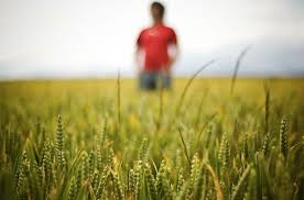
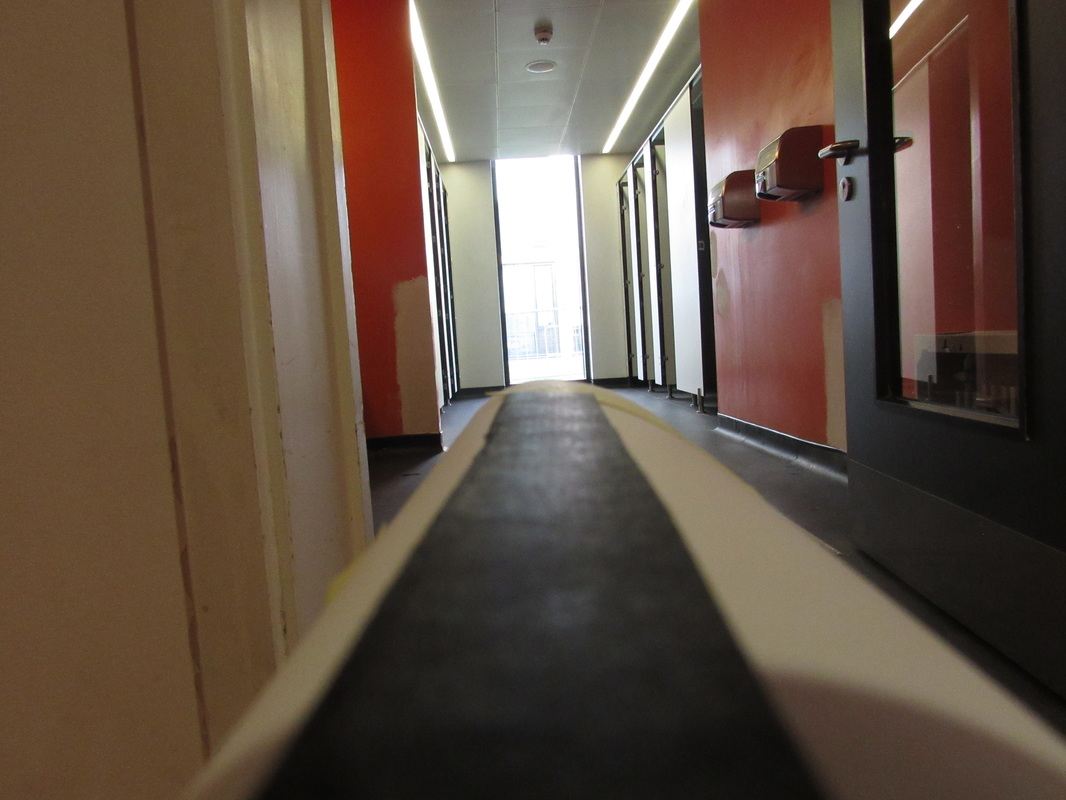
Genre; Landscape
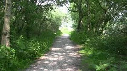
|
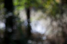
This is a landscape themed/genre photograph that i have taken myself in a forest in Italy. I like this photograph mainly because it seems peaceful and mysterious at the same time which i find very eye catching. There is also a very clear perspective line which are one of my favourite things i like to see in photographs. There is actually a river on the left side of the path but the nature is covering it.
I think this picture if it were to be in a gallery would look best on if it was surrounded by other pictures that are of nature, for instance a water fall could look nice but there needs it will need to have a bit of green so the colour would be spread out evenly. When i look at this picture is makes me feel very curious and a bit scared. Curious because i would very much like to know what is at the end of that path and where we are, there also seems to be a track on the path made of pebbles so there must be a reason for that but scared because i seem to be very deep in a forest, it doesn't look like there are any people with me and the weather isn't very good because there are puddles all over the place. |
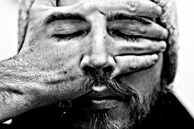
Abstract homework
|
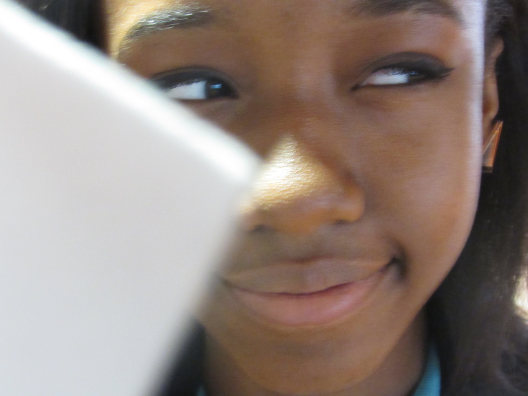
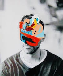
This image is abstract because it breaks the rules of photography by having the mans face still see-able through his hand. I think the black and white filter makes the image a lot more eye catching as the quality of the image is still very good as you can see each little hair and wrinkle. The tones in this abstract photograph is very good as it is evenly spread across the image, there is not too much of a dark tone and not too much of a light tone either. Most of the outlines are very clear and in focus, but compare the lines of the mans eyes to the lines of the mans hat you can see there is a large difference as the camera seems to have been focused on the centre of the image rather than the borders.
|
|
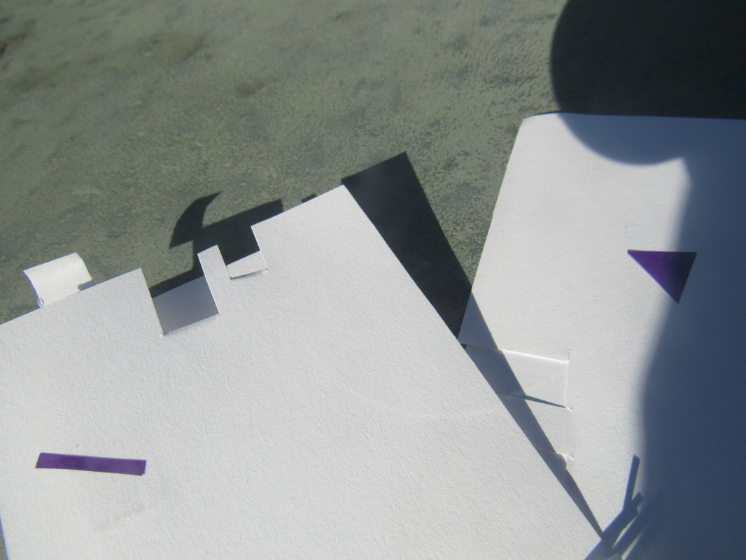
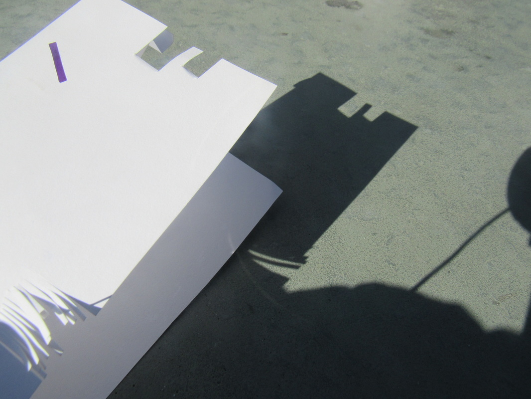
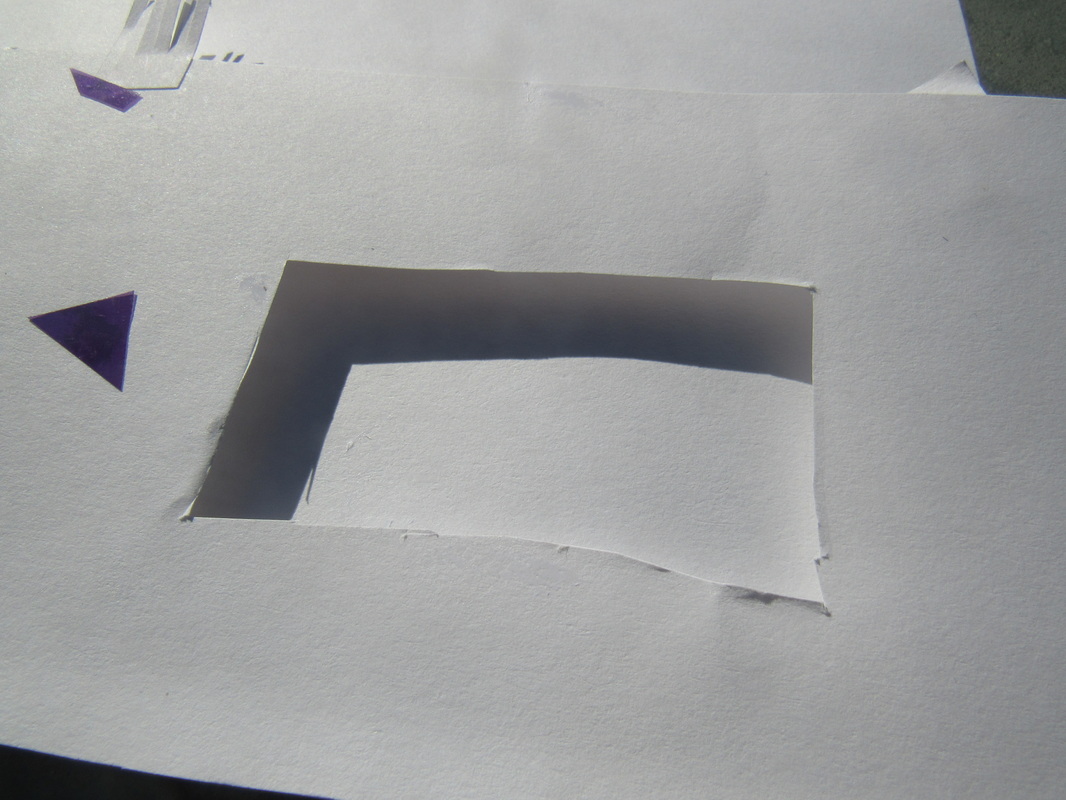
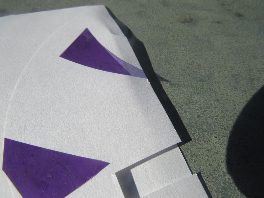
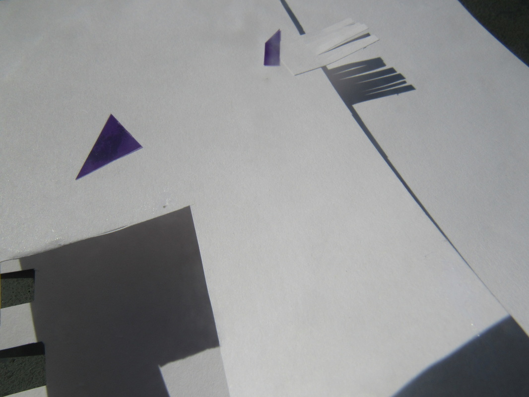
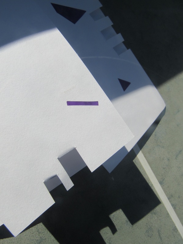
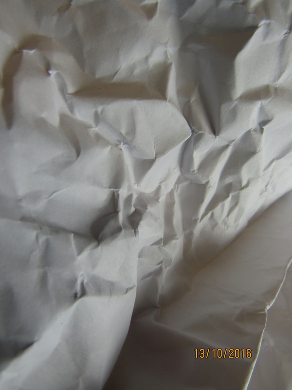
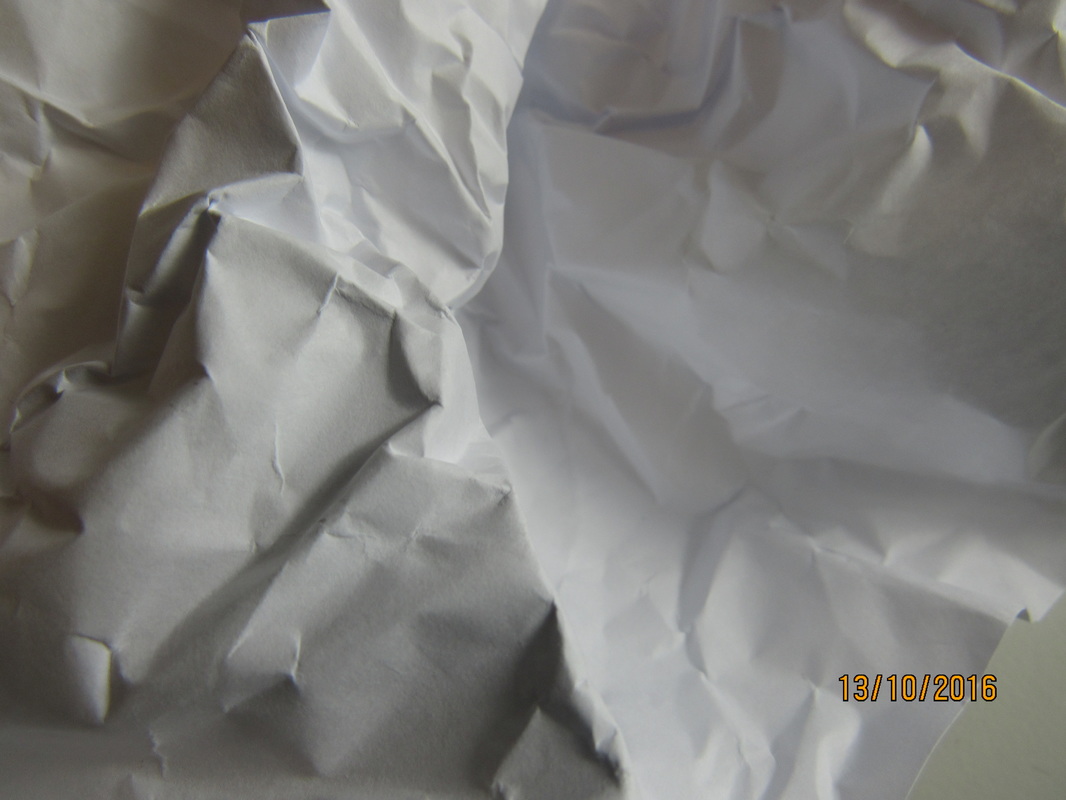
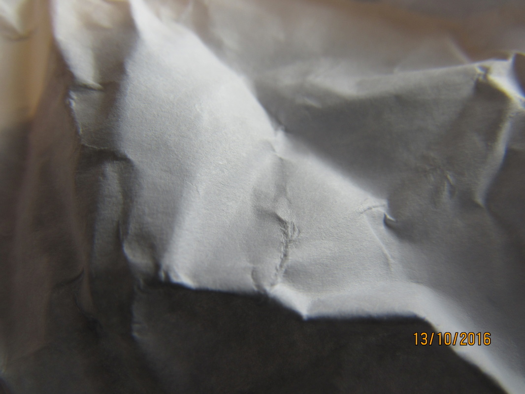
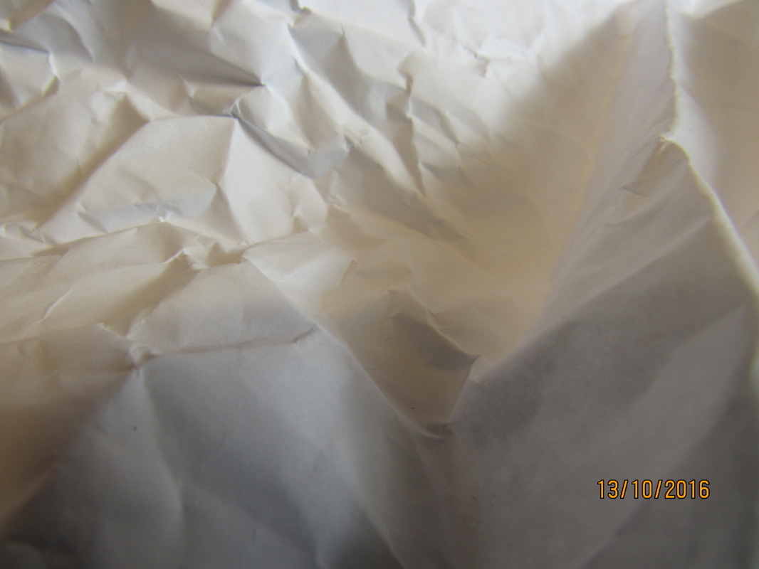
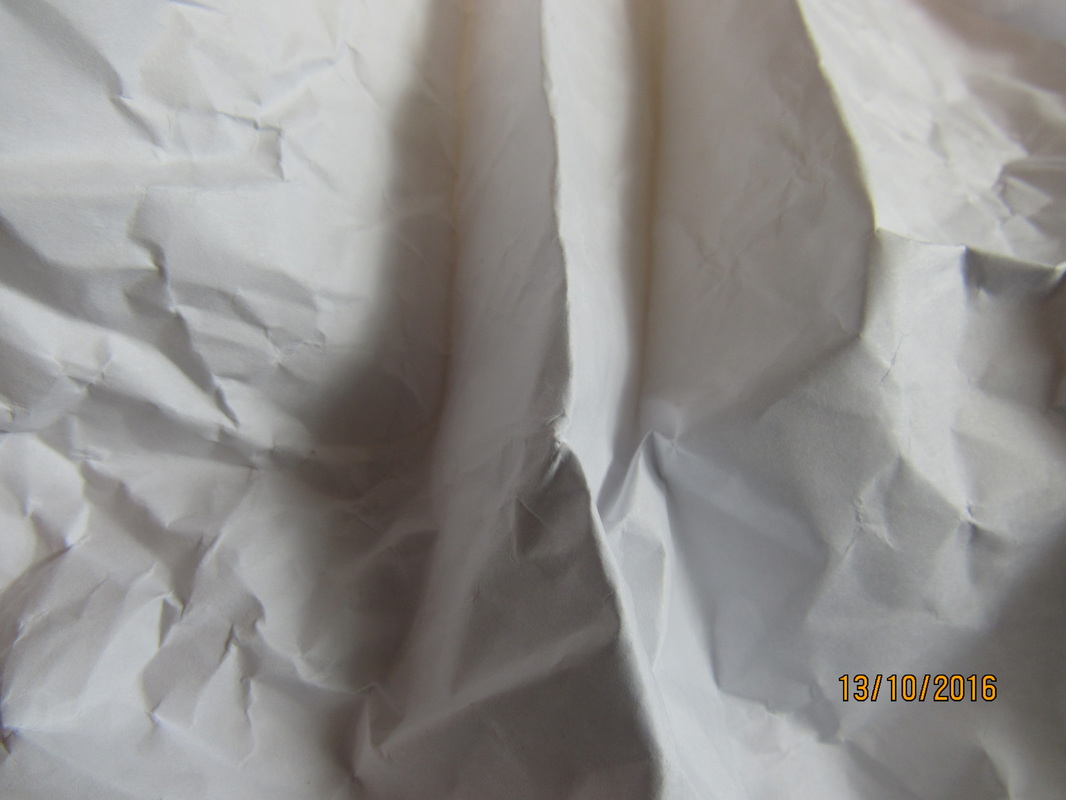
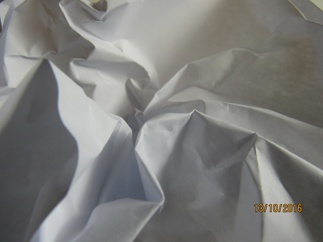
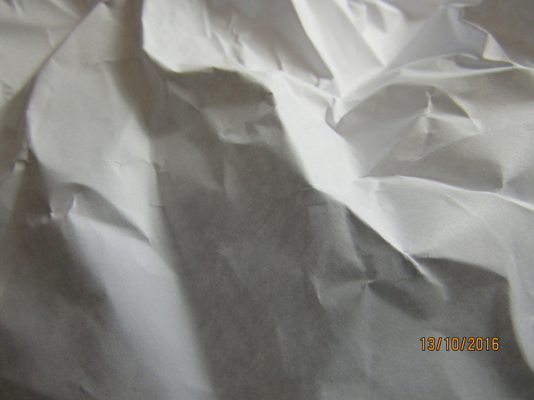
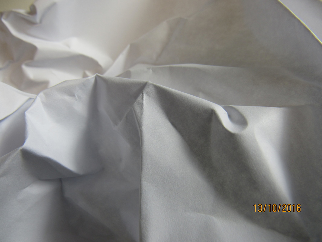
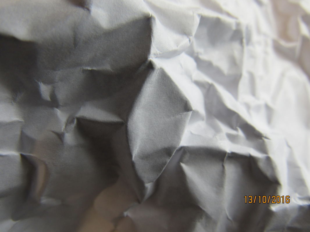
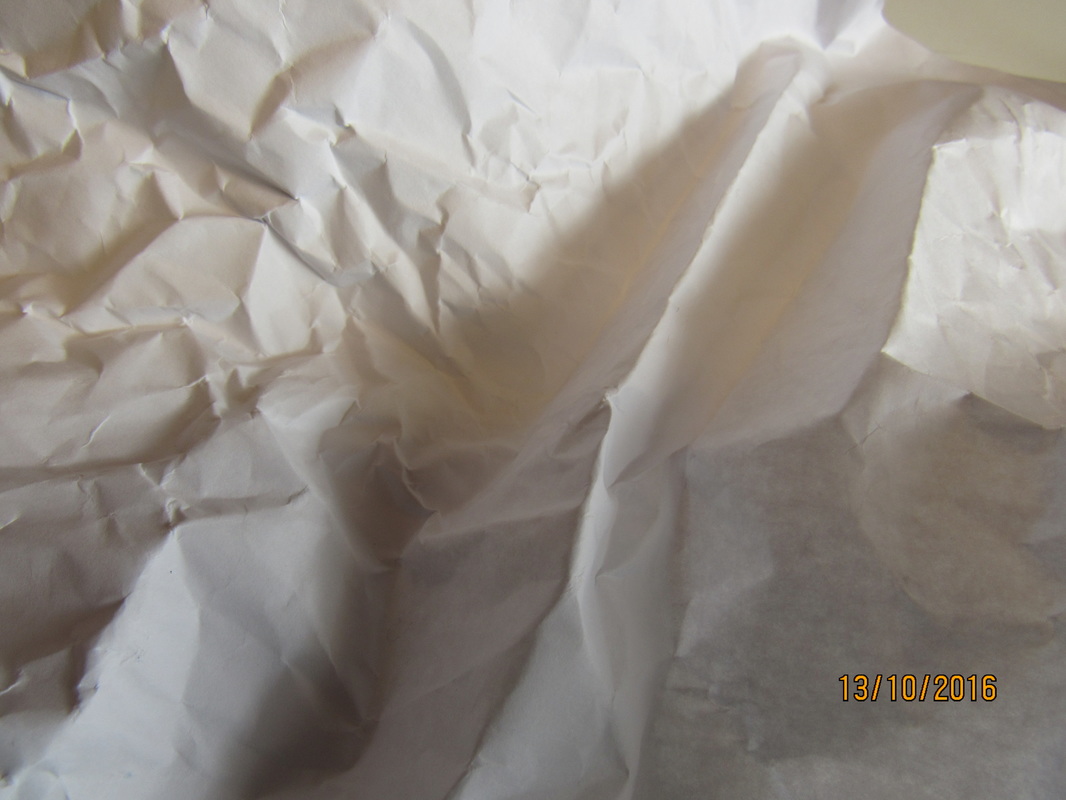
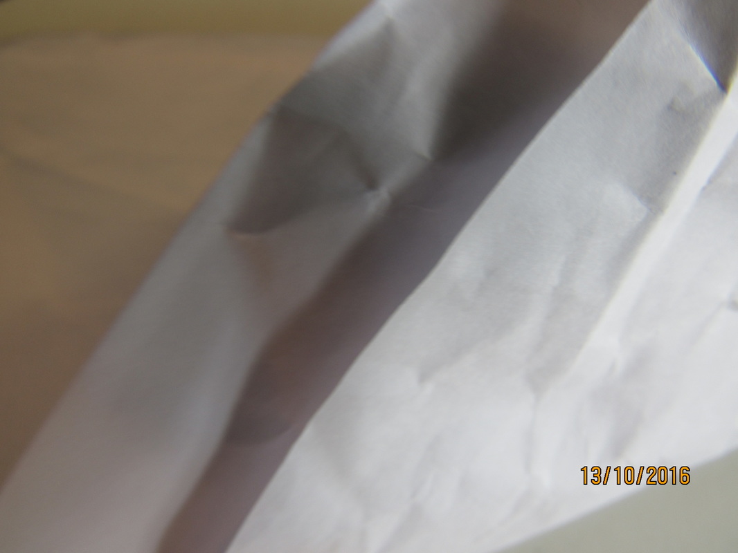
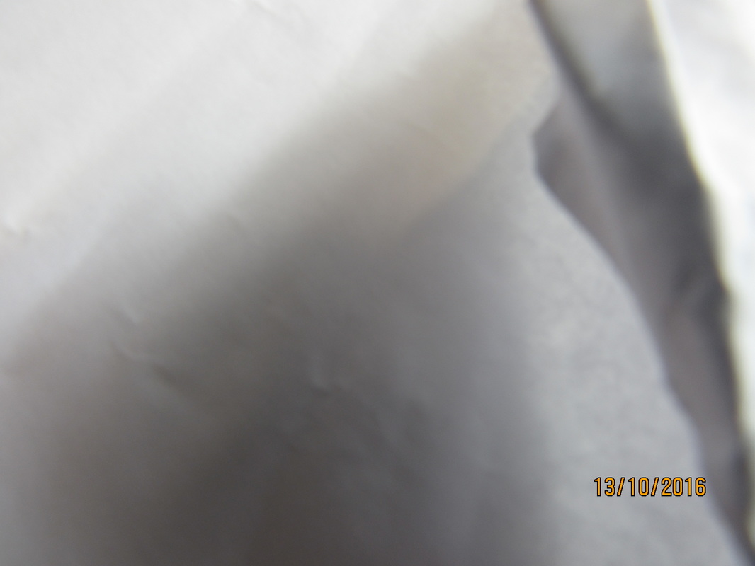
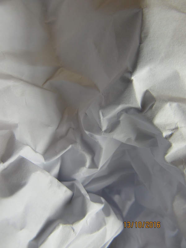
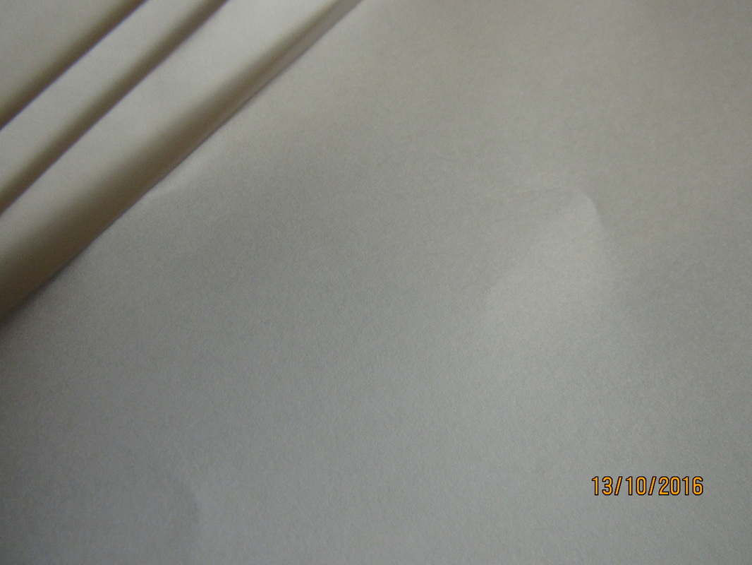
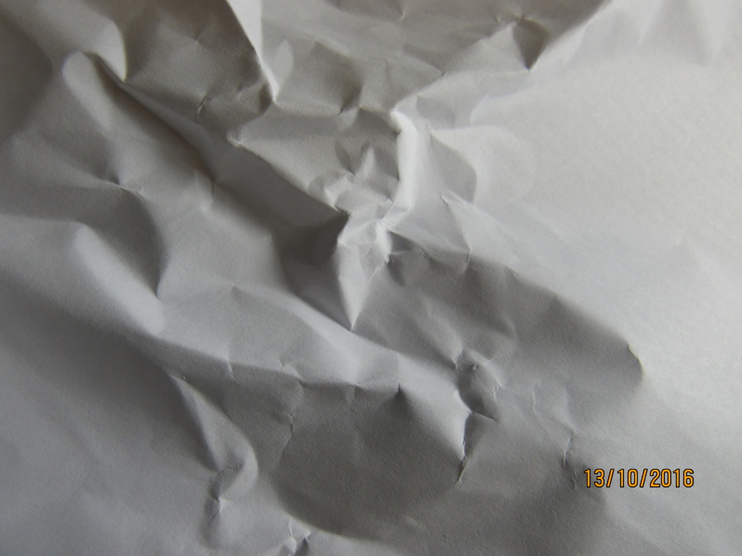
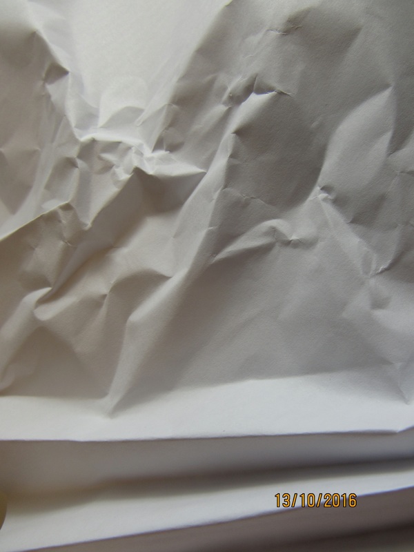
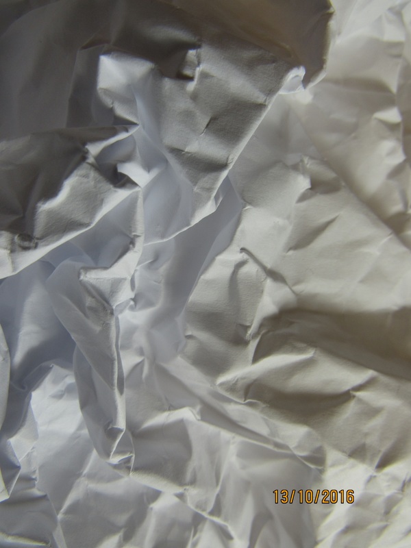
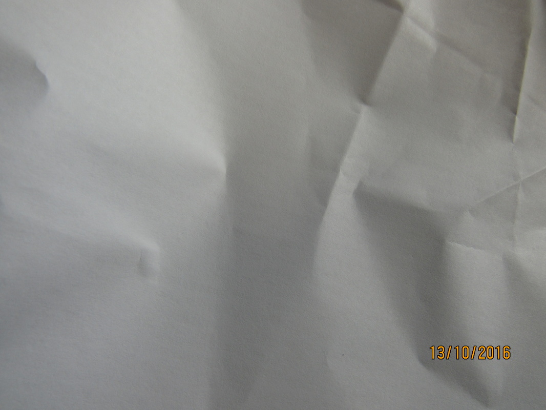
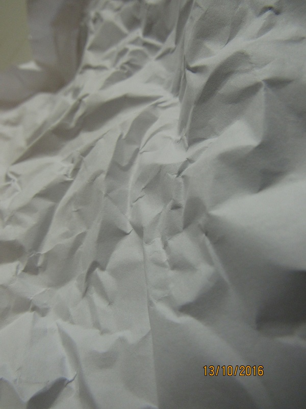
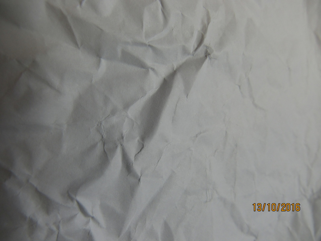
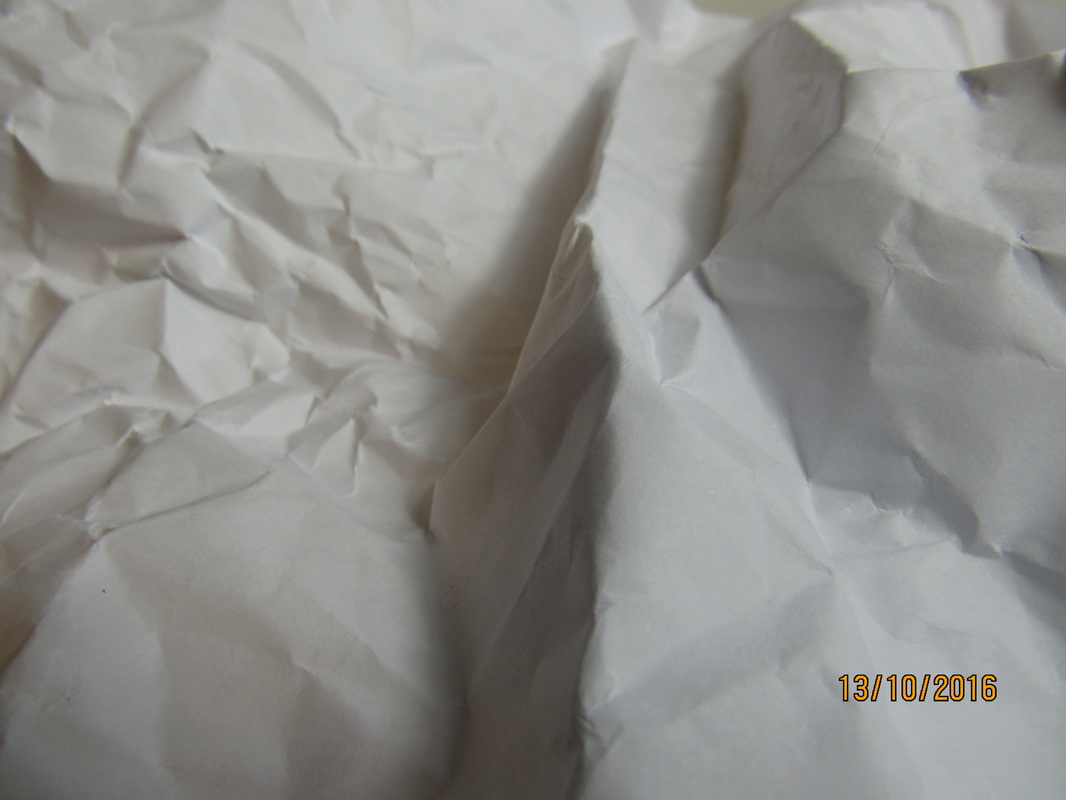
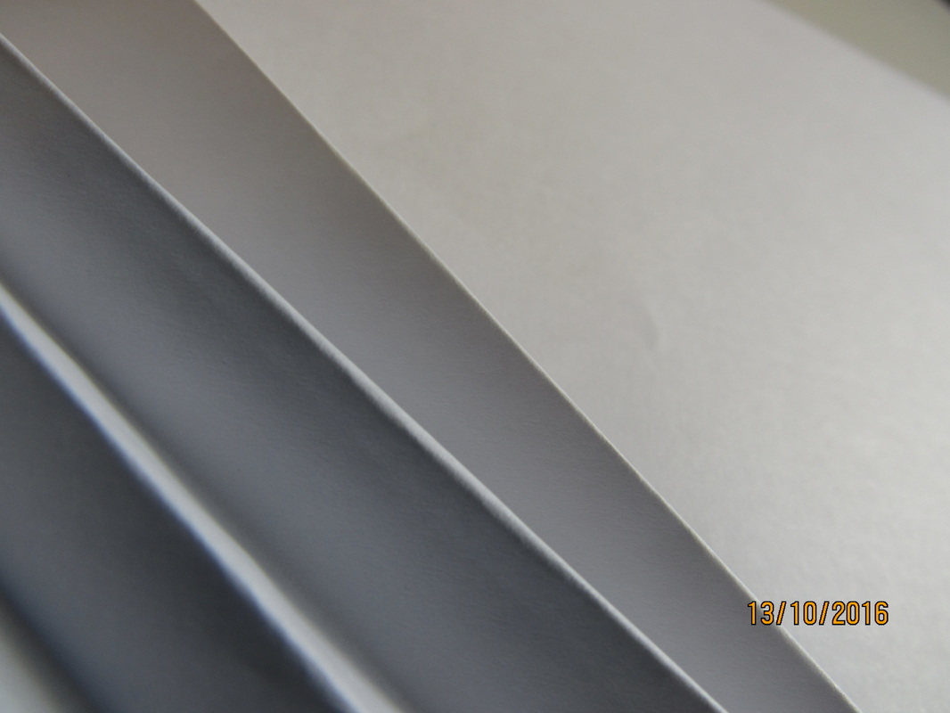
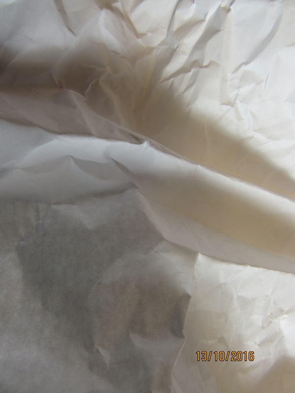
Paper
|
|
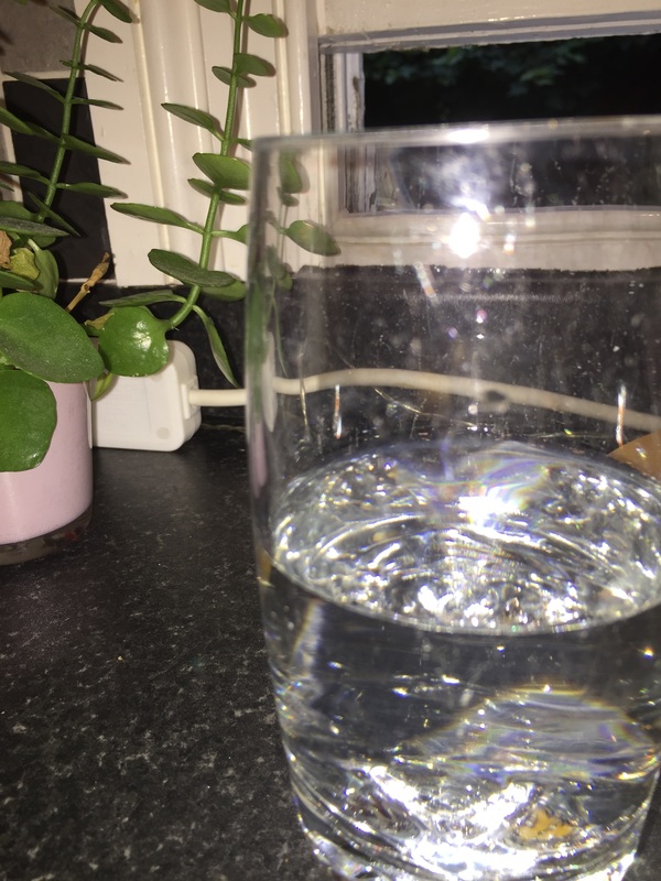
The task today was to take six-teen photographs of a piece of paper which we had the choice to bend and crumple up in different angles and different lighting. I think the task was not extremely challenging but i did start to run out of angles to take each image from. Doing the task was very enjoyable as i was with my friends and i liked seeing the different textures the paper could have. Risks weren't a problem as it is just a piece of paper but i tried to go near the window to see if the natural lighting would make the photograph feel more soft rather than harsh. I think my photographs look very abstract as of the angles, the amount of lines, and how close up the images look.
|
Homework.
|
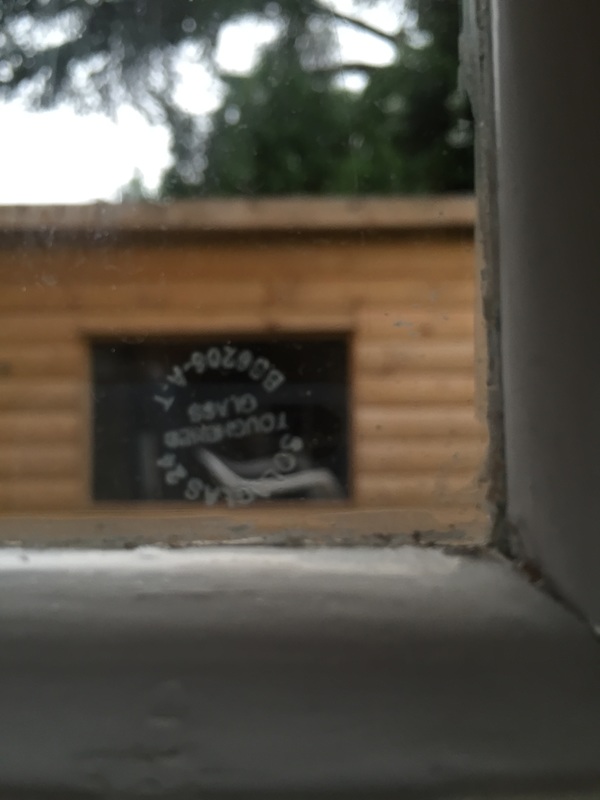
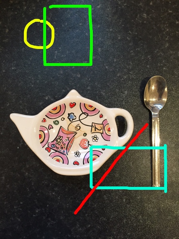
At home I took three abract images. I found this task much more chalanging than I thought it would be as trying to find something on the window and then getting the cameras to only focus on that (and not the background) was extremely difficult (the third image). The first image I find worked the least well as I tried to use depth of feild to make my photograph abract. I do not think this worked well as the theme of my image is not very clear or interesting to look at. The third image i find worked the best as you can clearly understand the point of that image was to have shapes being drawn over the main subject. I used snapchat to create the different cloured lines which i had to draw my hand.
|
|
Sculpture photography
|
|
Todays task was to take around 10 photographs using the sculptures we made in a previous lesson and make the art work be part of the image. I found this lesson quite challenging as i wasn't sure as to what else should be in the picture and what lighting was best. I think my images turned out alright but need improvement as there is a lot of background which i do not think looks professional
|
Home learning
|
The task for this homework was to take about 16 images which all were taken out of focus, extreme close up and at an unusual angle. I found this task very challenging because I wasn't sure as to which angles were good enough and what to take the pictures of. Most of my photographs are hard to understand as to what it is of and that part I do not like at all.
|
|
Today's abstract lesson
|
|
Todays lesson was to take 5 abstract photographs around the school. I found this task quite challanging as I had to find a number of themes e.g close-up, depth of feild ect.
|

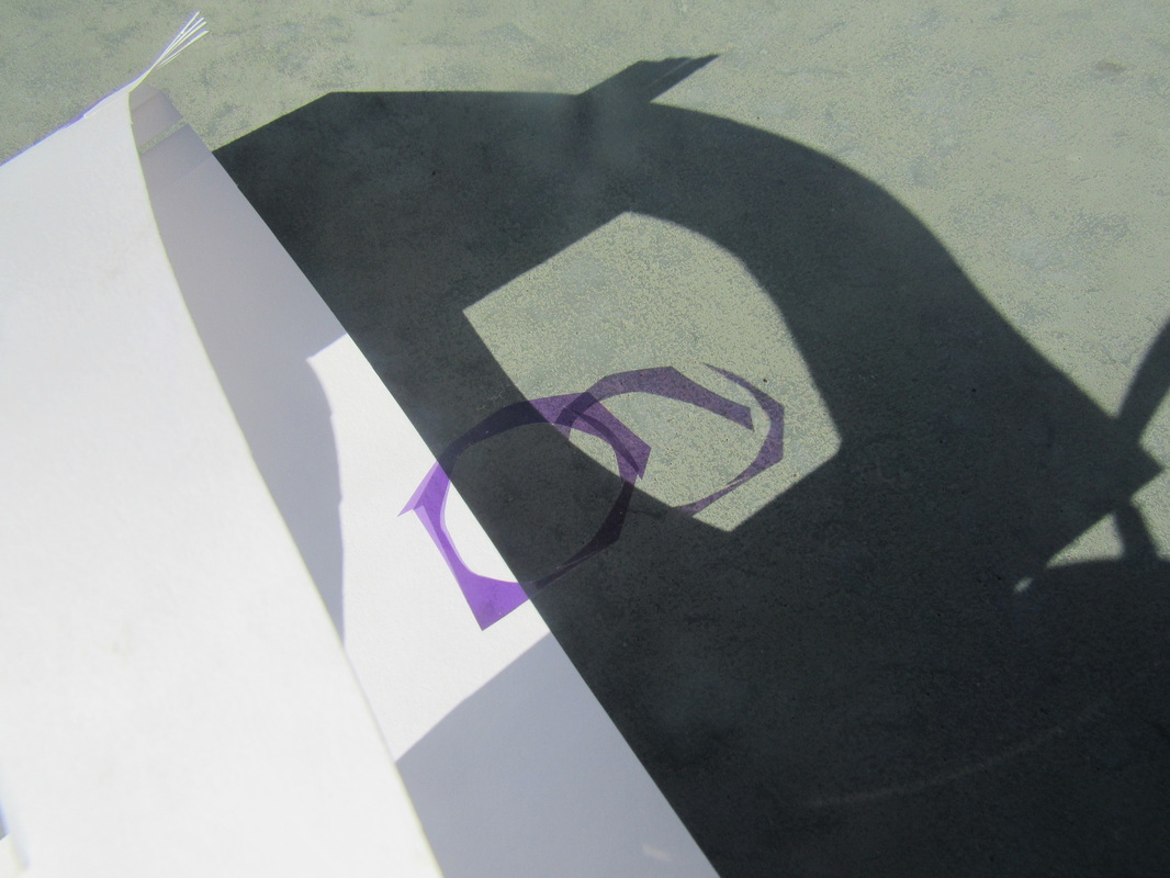
Inspired Work
|
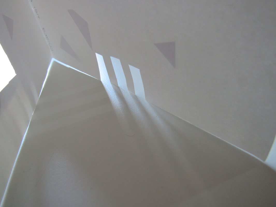
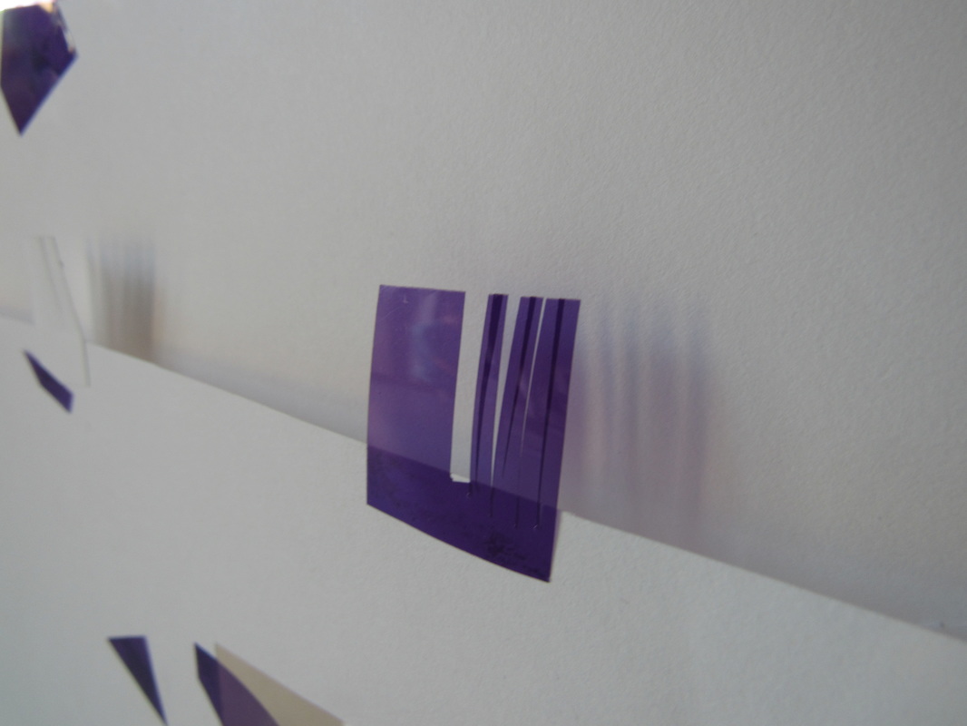
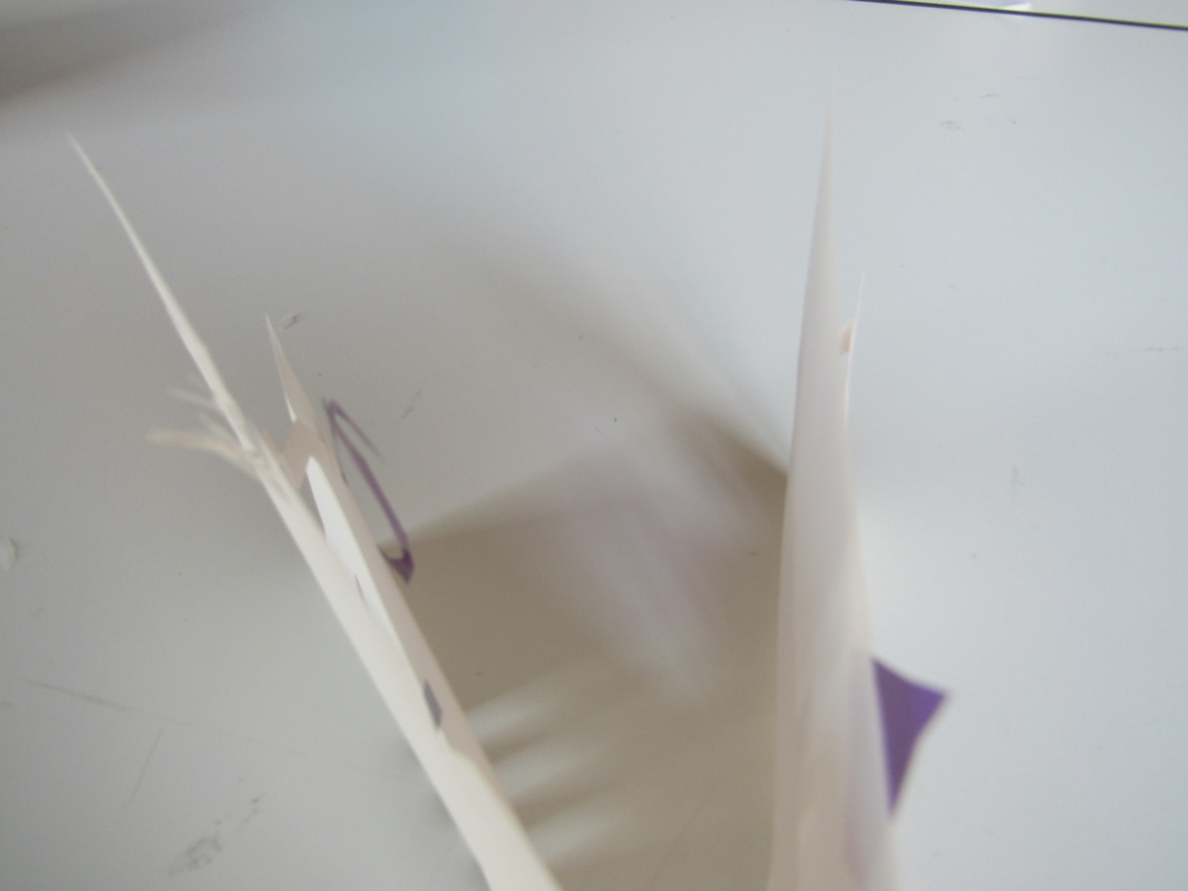
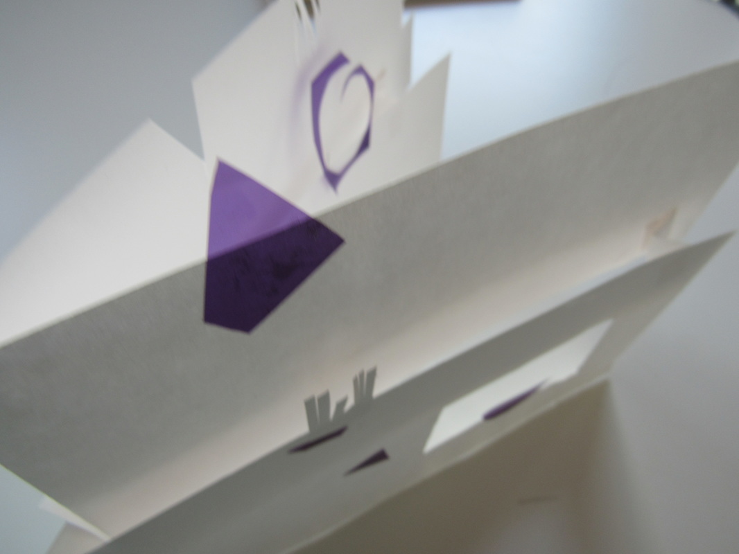
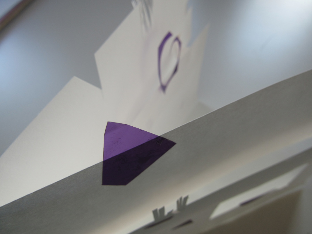
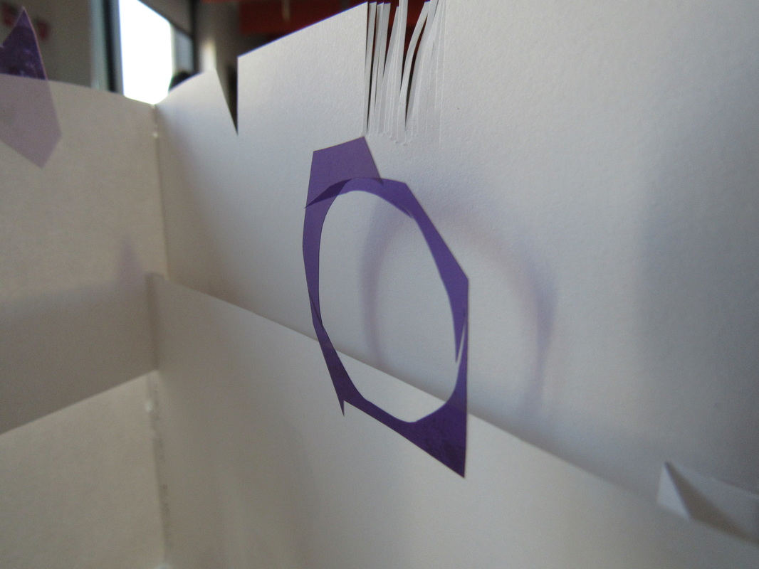
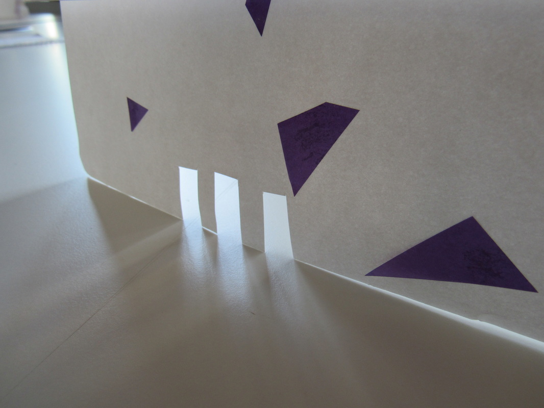
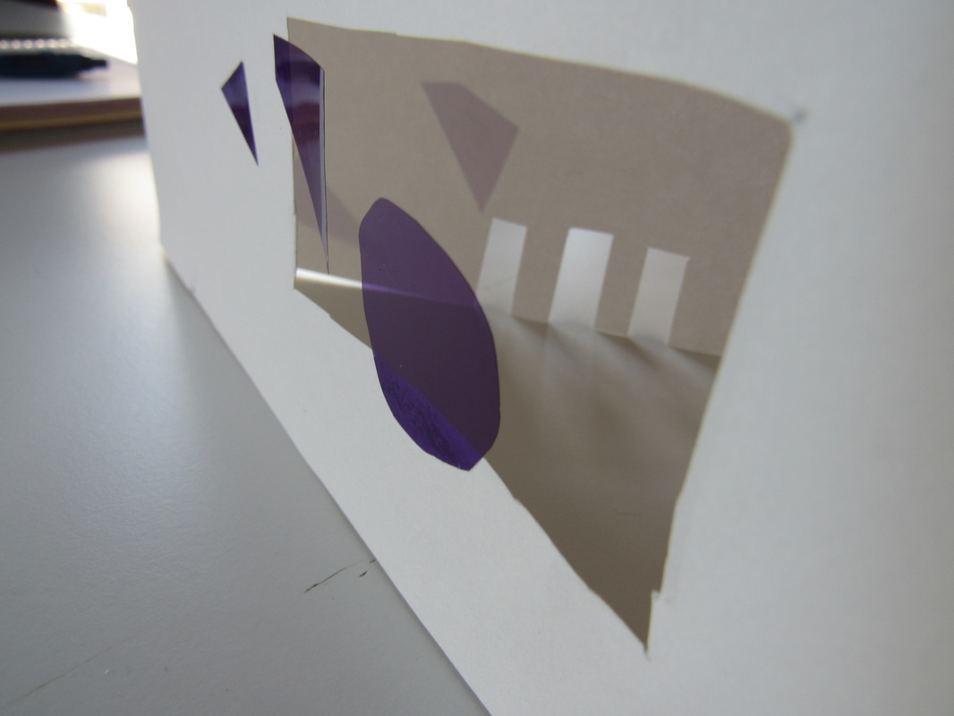
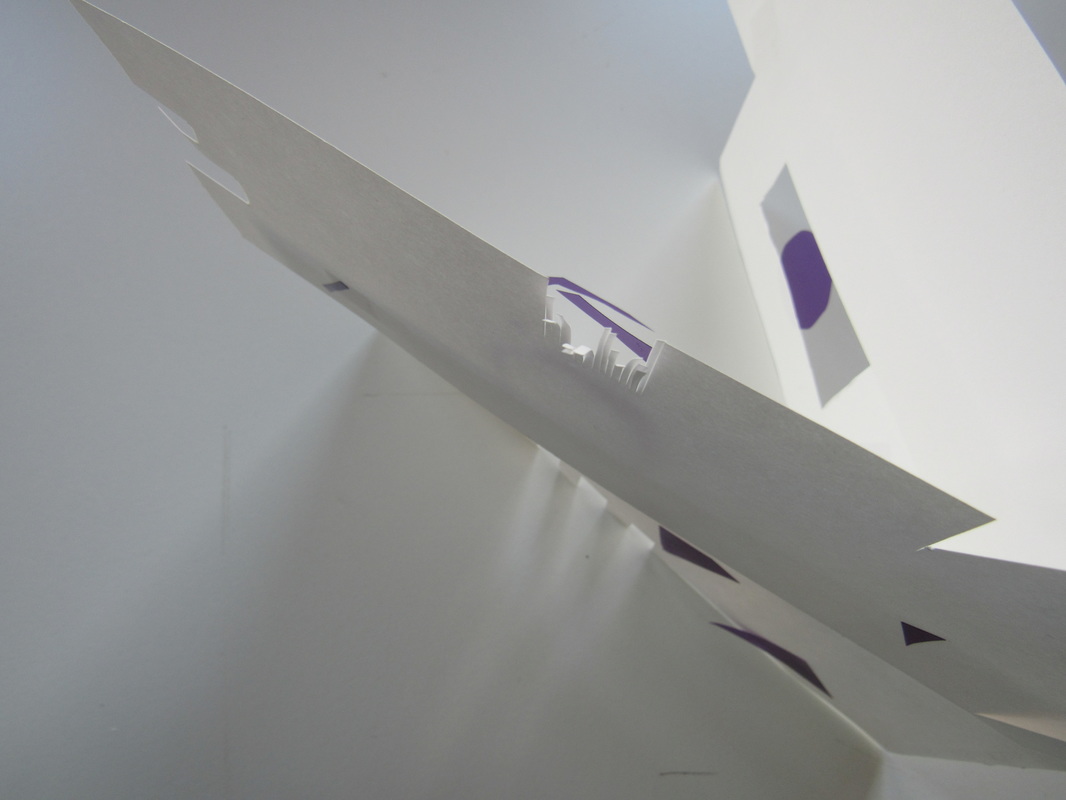
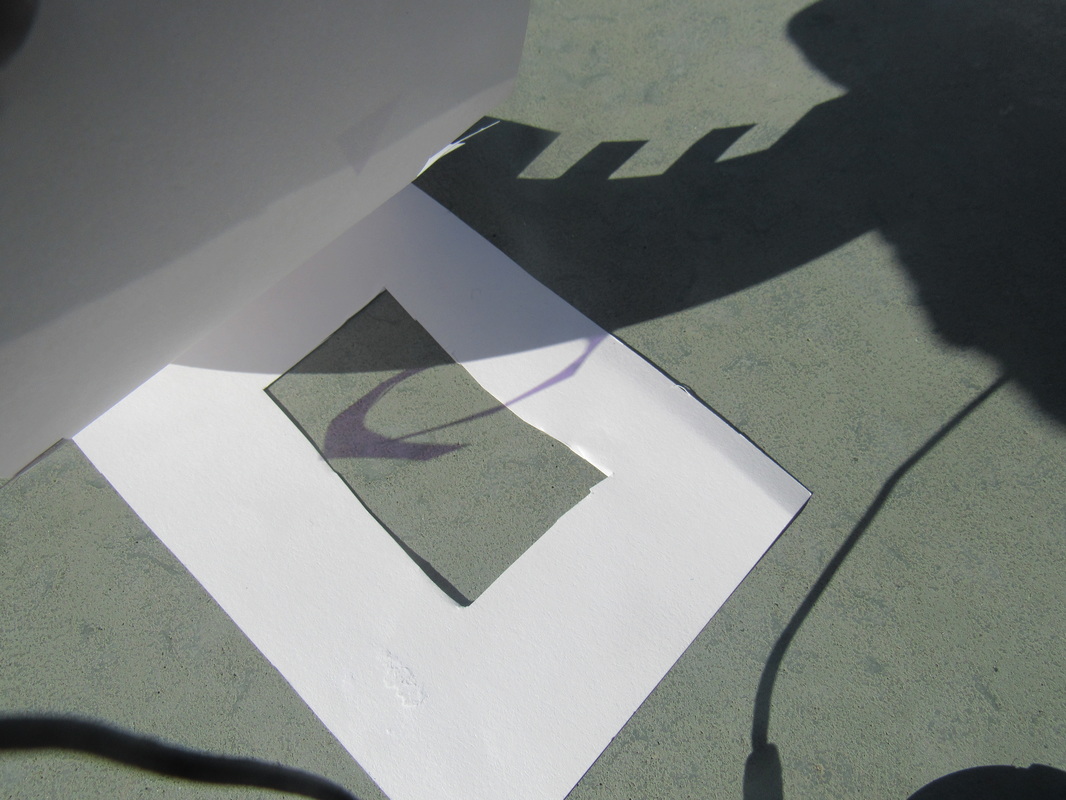
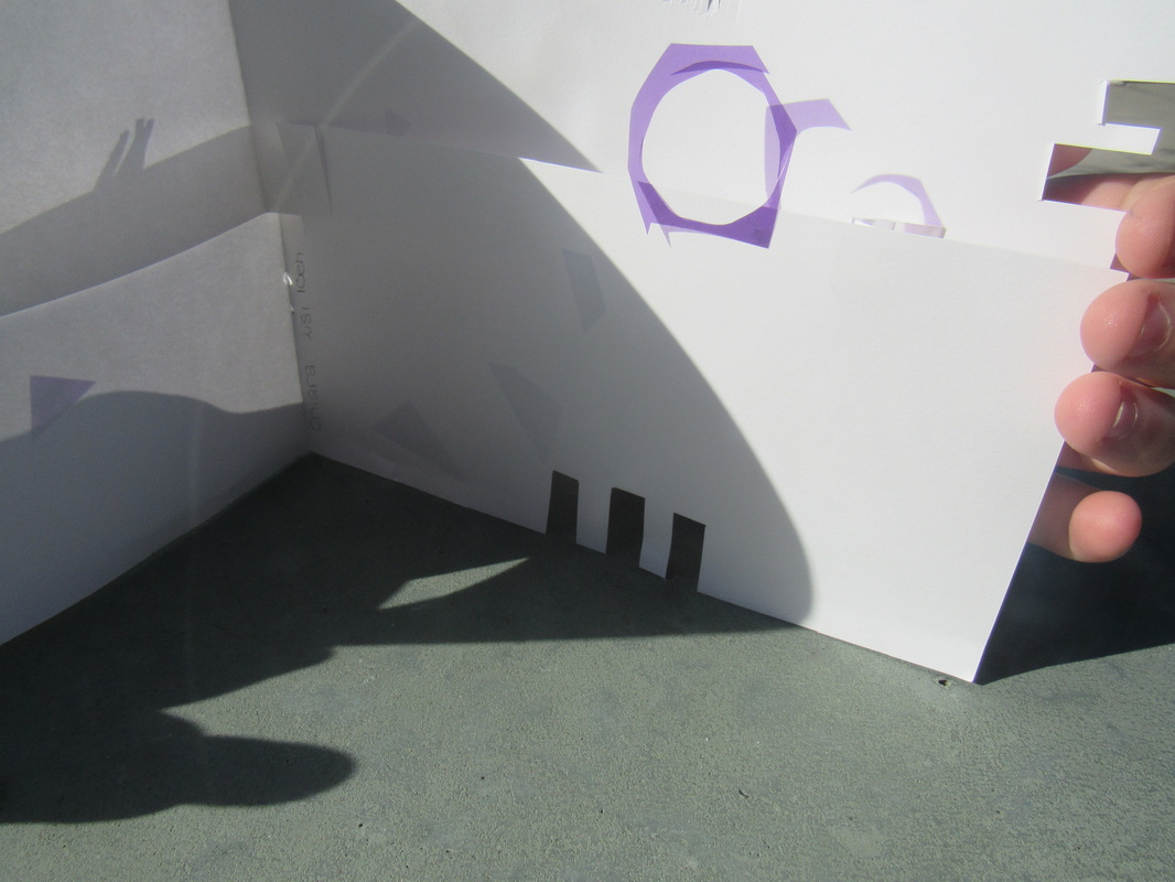
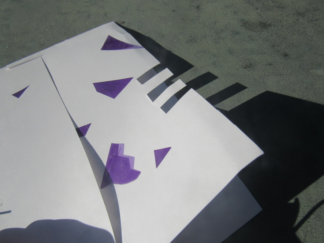
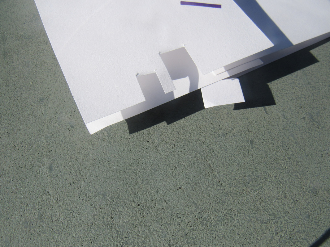
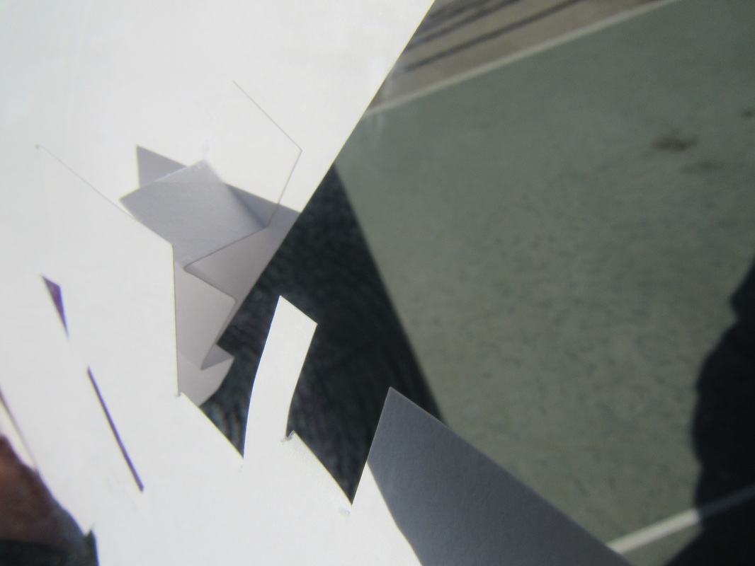
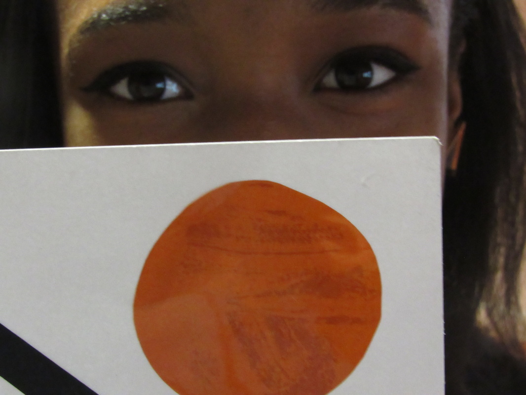
These images were made in the dark room with an enlarger using the hand made slides we made in the previous lessons. In the photograph on the left I have stuff small circular stickers as this image was inspired by Jonh Baldissari (who is known to do the same).
|
|
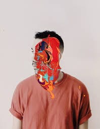
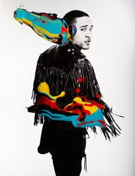
Jonni Cheatwood
|
|
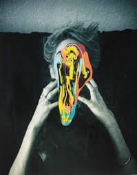
Jonni Cheatwood is an American-Brazillian artist known for multiple catigories, painting, photography and fashion are some. The reason I picked Jonni out of all the other millions of abstract photographers is how he manages to use so many colours in one area and the way Cheatwood's photographs feel mysterious. Most of Jonni's work consists of black and white portraits with multiple colours of paint over their faces. My favourite image out of the nine that I chose is the first photograph on the forth row (bottom row). I like this picture the most because of how the paint has been able to drip in a non-complex way. This appeals to me as things with a simple design in my opinion usually look the best. |
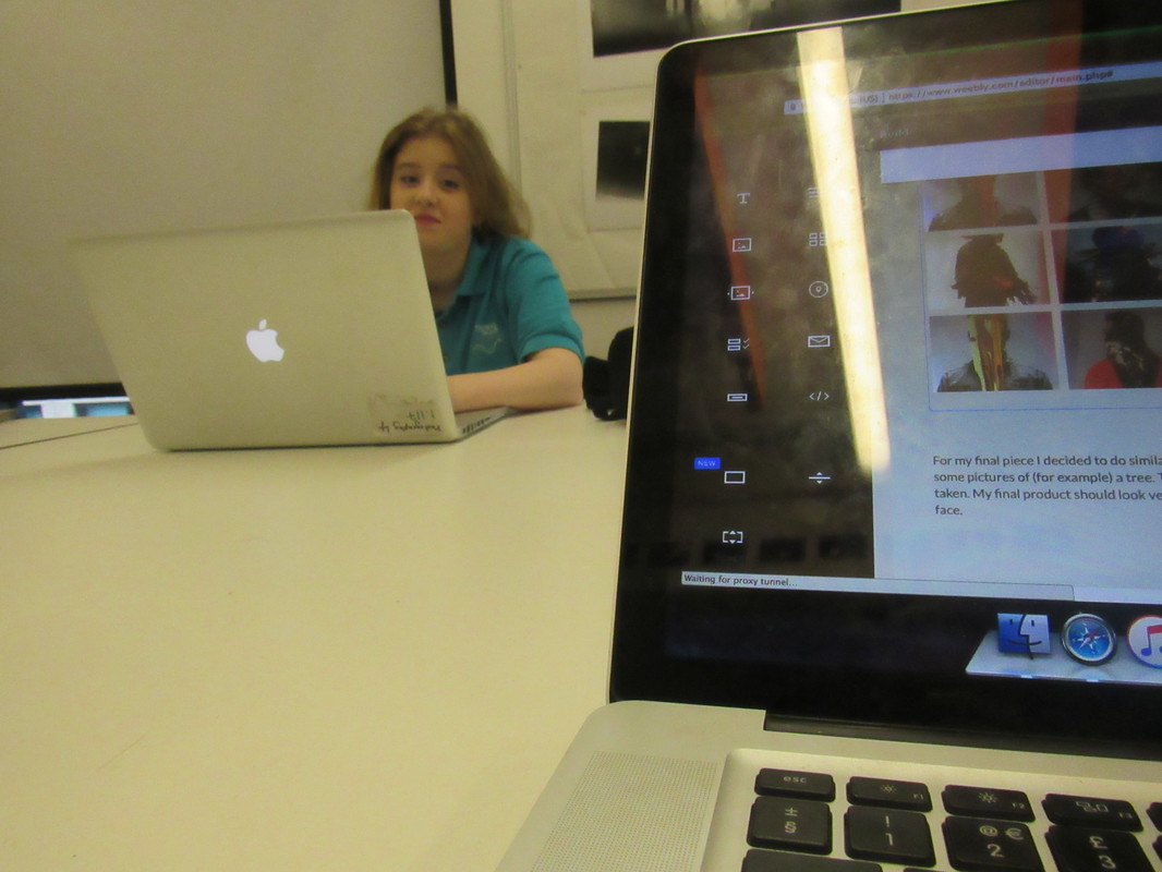
My Final Piece Plan
|
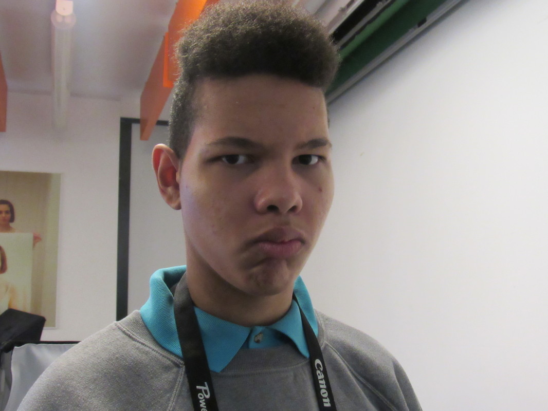
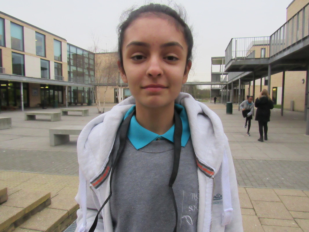
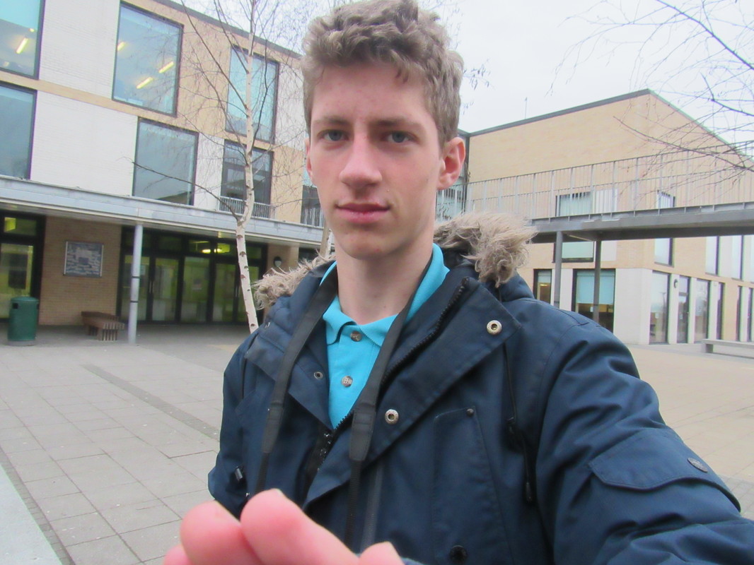
For my final piece I decided to do similar work to Jonni Cheatwood. I plan to take a number of portrait photographs of people in my classroom and some pictures of (for example) a tree. I am using the images on the right, then I want to use multiple bottles of nail varnish which I have at home to paint over the photographs I've taken. My final product should look very close to Cheatwood's work as I enjoy the mysterious vibe it gives off as you are unable to see the subjects face. I hope my final piece looks original and doesn't look like I've completely copied Jonni Cheatwood's work. This idea for a final came to me when I was looking through pinterest and found one of Cheatwoods creations (I saw the first image out of the twelve above). |
|
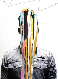
FINAL PIECE
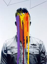
This is my final piece for abstraction. Initially I had 18 planted photographs but they sadly were lost therefore I now have only 9. My process of making this final piece included a camera, a printer and nail varnish bottles. I took the images on my camera from school and aimed to take photographs with peoples faced in them, I printed out my favourite ones using the schools printer on photographic paper and I then painted them each individually using a range of colours from my nail varnish collection.
I think the end product does not look to the standard I'd hoped it would look like. I'd hoped my final product would be much more eye-catching and neatly done. The images would have looked much better if the nail varnish dripped in much thinner and longer lines. I think it looks better with more slender nail varnish marks on them because the end of the 'drip' would have a sharp point on the end which gives the photographs a sense of fine details.
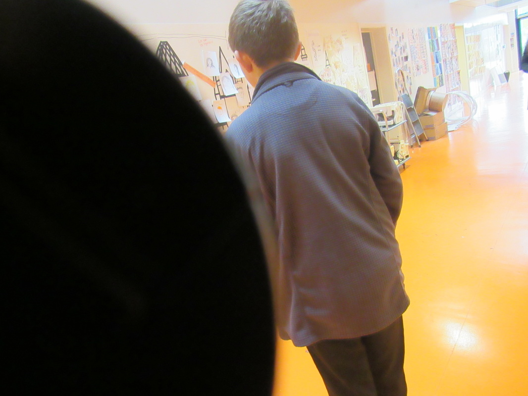
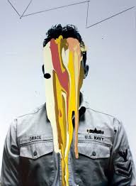
An example of one that did not do well in this sector is the photograph of a young boy walking on a green floor with dark green dripping from his face and the top of the image. In this image I let the nail varnish drip naturally so I did not help it go straight or fall in a much cleaner and thinner line. This created (as you are able to see) a very wide, stubby line without a sharp end. I think this does not look good as it seems to have been done to a very low standard.
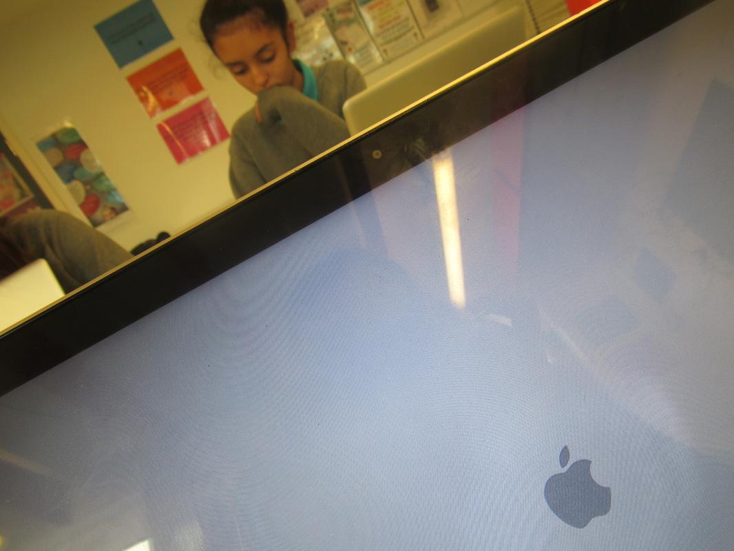
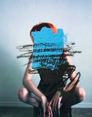
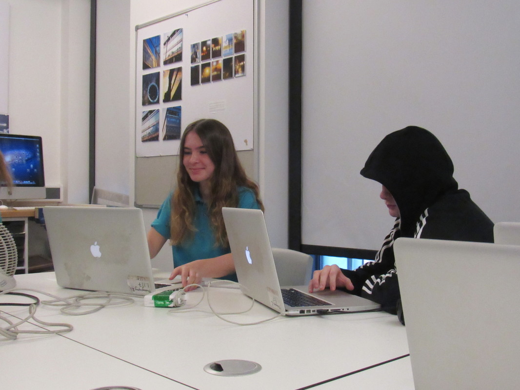
Whereas the image of a girl on an apple computer with another computer in the foreground look much more professionally done. I believe this as the nail polish was done in very fine lines and I think the colours compliment each other. I the colours also don't clash with the photograph itself. which most of the other images do. The blue nail varnish and turquoise nail varnish were equally used throughout the photograph which gives a sense of control as the photographer seems to have planned where and how to place the paint on the image.
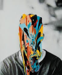
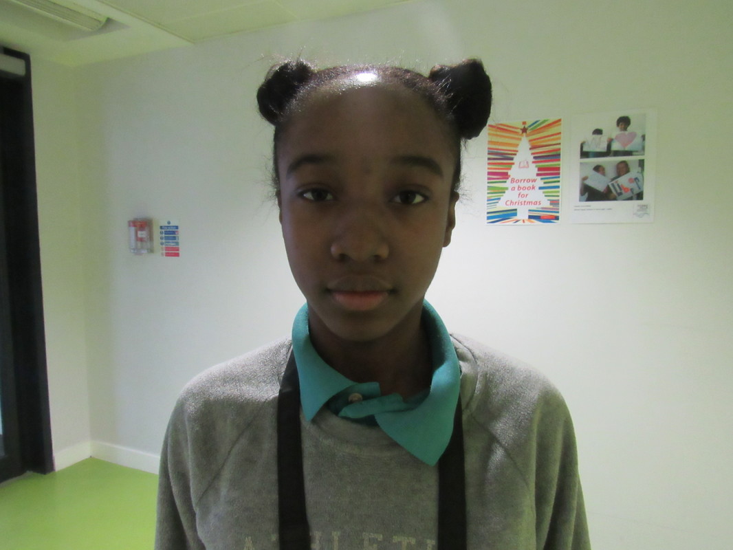
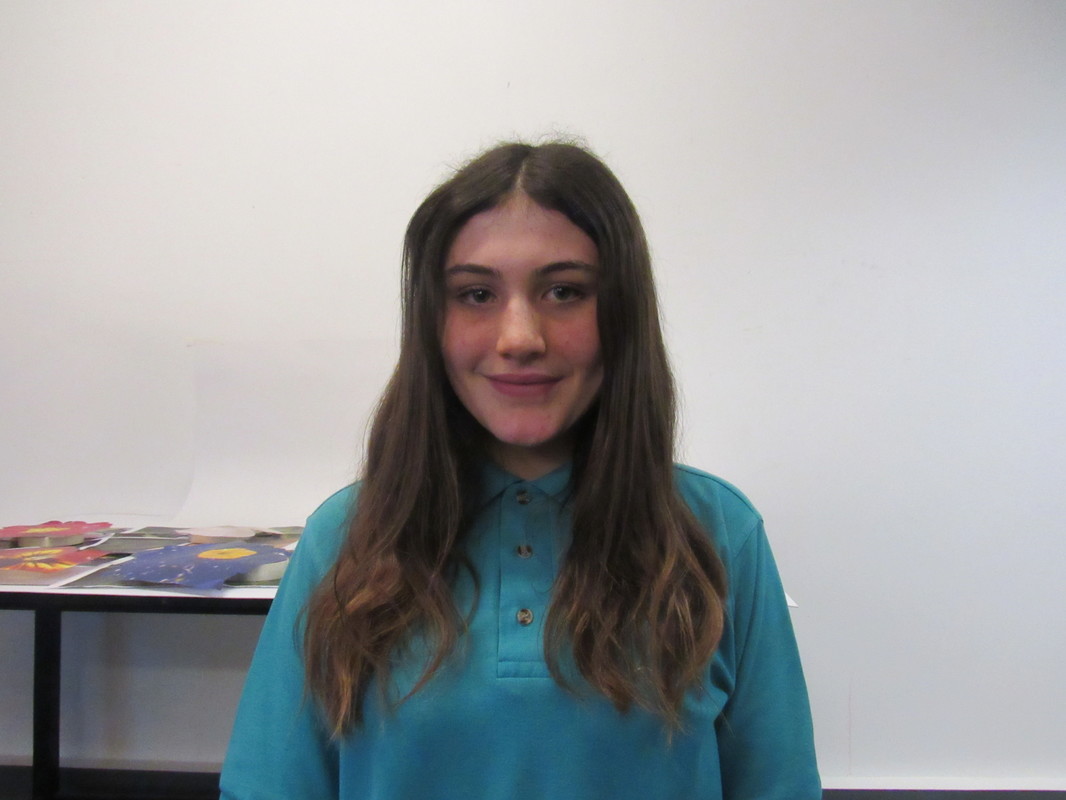
I'm now going to evaluate one of the images which I like the most. This photograph is of a girl with brown hair down past her shoulders and she is just standing straight facing the camera. This is a traditional portrait picture as the main subject is someones face and they are in the centre go the photograph just looking straight. But what isn't traditional about my portrait image is that I have covered her face with turquoise and purple nail varnish. I chose to do this as my work was inspired by Jonni Cheatwood who covers the subjects faces all of the time.
What I did differently in this photograph compared to the others was instead of having the nail polish drip off of their faces, in this photograph i had the face be covered perfectly (as you can see I even went into detail by putting the nail varnish in her hair parting) then while the nail varnish was still fully wet I added dots of lilac and with a needle I mixed those two colours in a way that patterns were made. I found this very difficult to achieve as paint usually mix together then form a new colour which is not what I wanted to happen. Even though it was hard to do I managed and created this image.
The reason I like this photograph the most out of all the others is because of how I was able to neatly fill in the subjects parting without going too over and into her hair. I find this looks favourable as the feeling it gives off are positive for example it makes the photograph look faultless and you can easily tell that the photographer purposely did that. I find this image also could raise a few questions of you were a viewer. Questions like Who is she? What does her face look like? Is she smiling? Is she happy or sad? How come the photographer chose to cover her face? Is there a reason for using those specific colours? and ect.
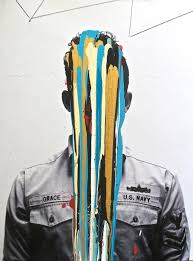
Another image which i feel needs to be explained is the photograph of a man on the train with two seats in the foreground. I think this image is particularly bad as the choice of colours is terrible. The colours themselves do not match each other as I think the red and yellow should not be next to each other due to them both being a 'fire' colour. I think it was also a bad choice of paint as having yellow be the main colour is unsatisfactory because you are able to see through it and identify the mans face. This gets rid of a number of questions for example Is he smiling? What does the man look like? and so on. At the top of the photograph you can undoubtedly see that the red and a small part of yellow has been touched and removed. This is because while leaving the images to dry one of the nail polish bottles near the images fell onto of this photograph and permanently damaged it. I also think that the placement of the different coloured 'drips' are not effective enough as the nail varnish just starts in the centre of the mans face.
I think the end product does not look to the standard I'd hoped it would look like. I'd hoped my final product would be much more eye-catching and neatly done. The images would have looked much better if the nail varnish dripped in much thinner and longer lines. I think it looks better with more slender nail varnish marks on them because the end of the 'drip' would have a sharp point on the end which gives the photographs a sense of fine details.
An example of one that did not do well in this sector is the photograph of a young boy walking on a green floor with dark green dripping from his face and the top of the image. In this image I let the nail varnish drip naturally so I did not help it go straight or fall in a much cleaner and thinner line. This created (as you are able to see) a very wide, stubby line without a sharp end. I think this does not look good as it seems to have been done to a very low standard.
Whereas the image of a girl on an apple computer with another computer in the foreground look much more professionally done. I believe this as the nail polish was done in very fine lines and I think the colours compliment each other. I the colours also don't clash with the photograph itself. which most of the other images do. The blue nail varnish and turquoise nail varnish were equally used throughout the photograph which gives a sense of control as the photographer seems to have planned where and how to place the paint on the image.
I'm now going to evaluate one of the images which I like the most. This photograph is of a girl with brown hair down past her shoulders and she is just standing straight facing the camera. This is a traditional portrait picture as the main subject is someones face and they are in the centre go the photograph just looking straight. But what isn't traditional about my portrait image is that I have covered her face with turquoise and purple nail varnish. I chose to do this as my work was inspired by Jonni Cheatwood who covers the subjects faces all of the time.
What I did differently in this photograph compared to the others was instead of having the nail polish drip off of their faces, in this photograph i had the face be covered perfectly (as you can see I even went into detail by putting the nail varnish in her hair parting) then while the nail varnish was still fully wet I added dots of lilac and with a needle I mixed those two colours in a way that patterns were made. I found this very difficult to achieve as paint usually mix together then form a new colour which is not what I wanted to happen. Even though it was hard to do I managed and created this image.
The reason I like this photograph the most out of all the others is because of how I was able to neatly fill in the subjects parting without going too over and into her hair. I find this looks favourable as the feeling it gives off are positive for example it makes the photograph look faultless and you can easily tell that the photographer purposely did that. I find this image also could raise a few questions of you were a viewer. Questions like Who is she? What does her face look like? Is she smiling? Is she happy or sad? How come the photographer chose to cover her face? Is there a reason for using those specific colours? and ect.
Another image which i feel needs to be explained is the photograph of a man on the train with two seats in the foreground. I think this image is particularly bad as the choice of colours is terrible. The colours themselves do not match each other as I think the red and yellow should not be next to each other due to them both being a 'fire' colour. I think it was also a bad choice of paint as having yellow be the main colour is unsatisfactory because you are able to see through it and identify the mans face. This gets rid of a number of questions for example Is he smiling? What does the man look like? and so on. At the top of the photograph you can undoubtedly see that the red and a small part of yellow has been touched and removed. This is because while leaving the images to dry one of the nail polish bottles near the images fell onto of this photograph and permanently damaged it. I also think that the placement of the different coloured 'drips' are not effective enough as the nail varnish just starts in the centre of the mans face.
